Case study
Building Hirak.devv
Designing a static-first publishing platform for technical writing — and treating information architecture, typography, accessibility and performance as one system.
- Platform Engineering
- Performance
- GitOps
I wanted a personal website, but I did not want a conventional portfolio.
Most developer portfolios are designed primarily to present projects, skills, and experience. I wanted something slightly different: a place where the projects, the technical writing, the experiments, and the process behind them could live together.
The website needed to function less like a portfolio and more like a small technical publication.
That created a more interesting problem than simply choosing a framework and building a few pages.
I needed to think about information architecture, content modelling, typography, responsive behaviour, accessibility, performance, authoring, previewing, static generation, and deployment as parts of the same system.
This is the journal of how I designed and built it.
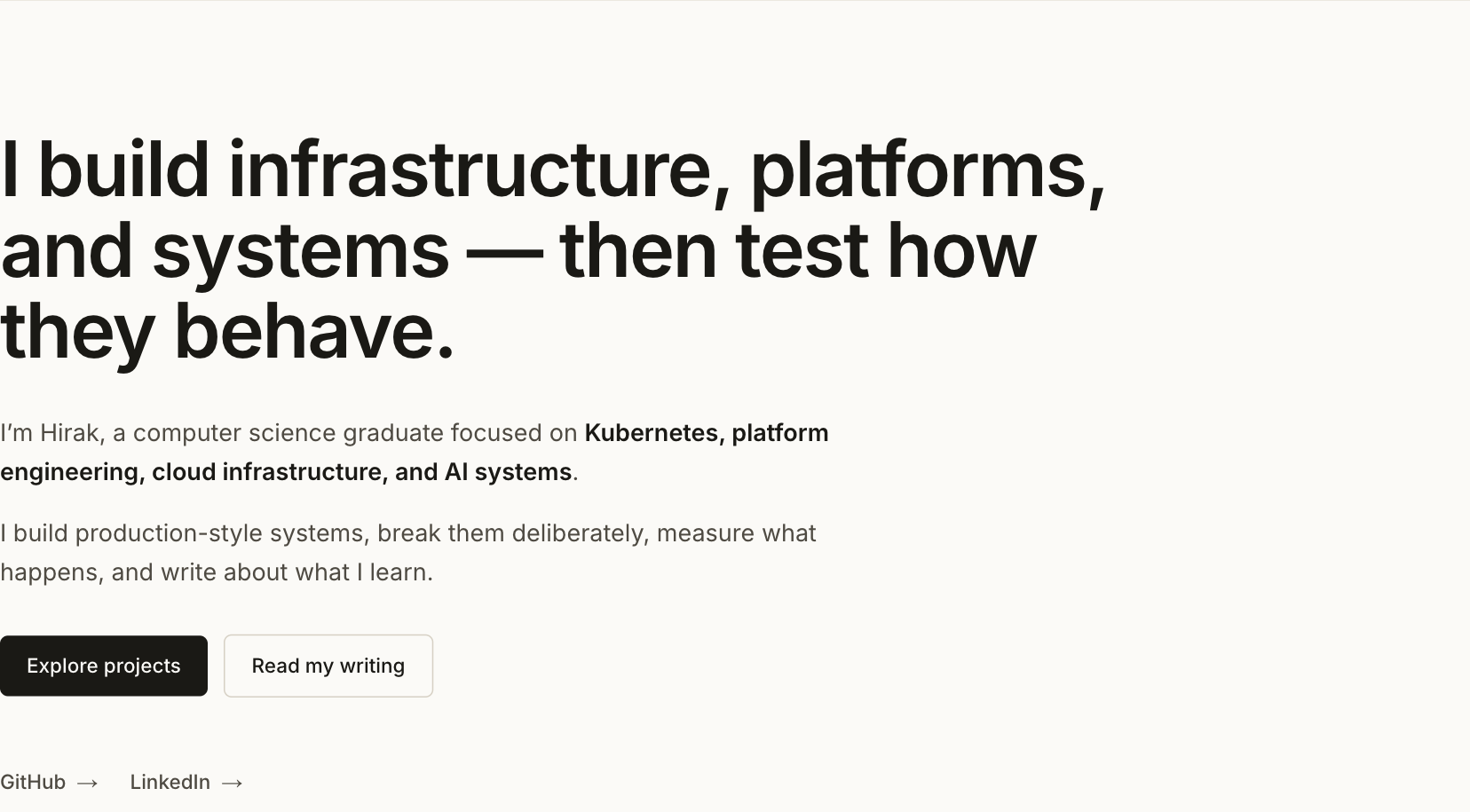
The finished home route — print-friendly, and still legible with all colour removed.
01. The problem
The original requirement sounded simple:
Build a fast personal website where I can publish projects and technical writing.
But several constraints appeared almost immediately.
I wanted:
- a CMS-style writing experience
- Git-based version history
- draft previews
- structured technical content
- static production pages
- very little client-side JavaScript
- strong SEO fundamentals
- excellent mobile behaviour
- reusable technical components
- automated deployment
- no runtime CMS dependency
The last requirement became particularly important.
I wanted a CMS for authoring, but I did not want visitors to depend on that CMS when reading the site.
The production website should behave like a collection of static documents distributed through a CDN.
That became the core architectural principle.
02. Before writing code, I simplified the site
My first sitemap was much larger.
I considered separate sections for:
- Projects
- Case Studies
- Experiments
- Blog
- Notes
- About
- Contact
Technically, those categories made sense.
From a reader’s perspective, however, the distinction was much less useful.
A benchmark, an engineering note, a tutorial, and an experiment are different editorial formats, but they are all ultimately pieces of writing.
The navigation did not need to expose every internal classification.
So I reduced the public structure to:
Home
Projects
Writing
About
Contact
The underlying site became even simpler:
/
├── /projects
│   └── /projects/[slug]
│
├── /posts
│   └── /posts/[slug]
│
└── /about
    └── #contact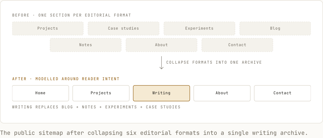
The decision was small, but it changed how I approached the entire project.
Instead of modelling the site around content labels, I started modelling it around reader intent.
03. One content model for writing
The next simplification was the content model.
Instead of creating separate schemas for:
Experiment
Article
Note
Tutorial
Case Study
Benchmark
I created one core content type:
PostA post contains:
title
description
slug
publishedAt
updatedAt
topics
featured
draft
cover
seo
body
The difference between a benchmark and an engineering note can be expressed through the content itself and through lightweight metadata.
The frontend does not need six separate rendering systems.
It needs one robust publishing system.
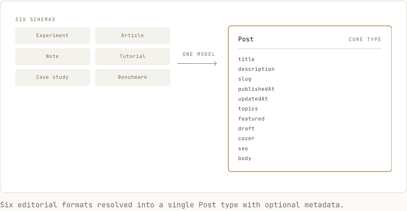
This reduced both implementation complexity and editorial friction.
It also made future changes easier.
A new kind of article does not require a new route or a new CMS collection.
04. September 7 — Minimalism was becoming emptiness
My initial visual direction was simple:
clean layout, lots of whitespace, restrained colour, very little decoration.
That sounds safe.
It is also easy to get wrong.
My first layouts had too much vertical space. Sections looked attractive when viewed individually, but the page felt disconnected when scrolling.
The problem was not a lack of visual polish.
The problem was that I had treated whitespace as decoration instead of structure.
So I introduced a controlled spacing system.
4
8
12
16
24
32
48
64
80
96
The exact numbers mattered less than the relationships between them.
Small gaps indicate association.
Large gaps indicate structural separation.
The interface started feeling much more deliberate once spacing followed a system instead of individual judgement.
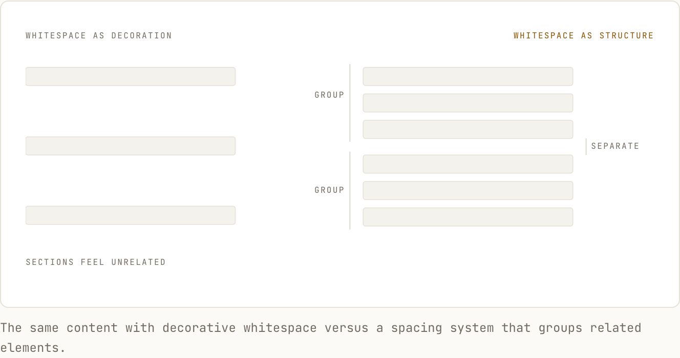
The lesson was simple:
minimal does not mean empty.
A minimal interface still needs information density, alignment, rhythm, and hierarchy.
05. The visual system
I wanted the site to feel closer to an engineering publication than a startup landing page.
That meant deliberately rejecting several common visual patterns.
I avoided:
- gradients
- glassmorphism
- large rounded cards
- decorative dashboards
- unnecessary shadows
- full-screen hero sections
- excessive animation
- floating navigation
- ornamental 3D graphics
Instead, the interface relies on:
- typography
- alignment
- thin rules
- restrained colour
- consistent spacing
- content hierarchy
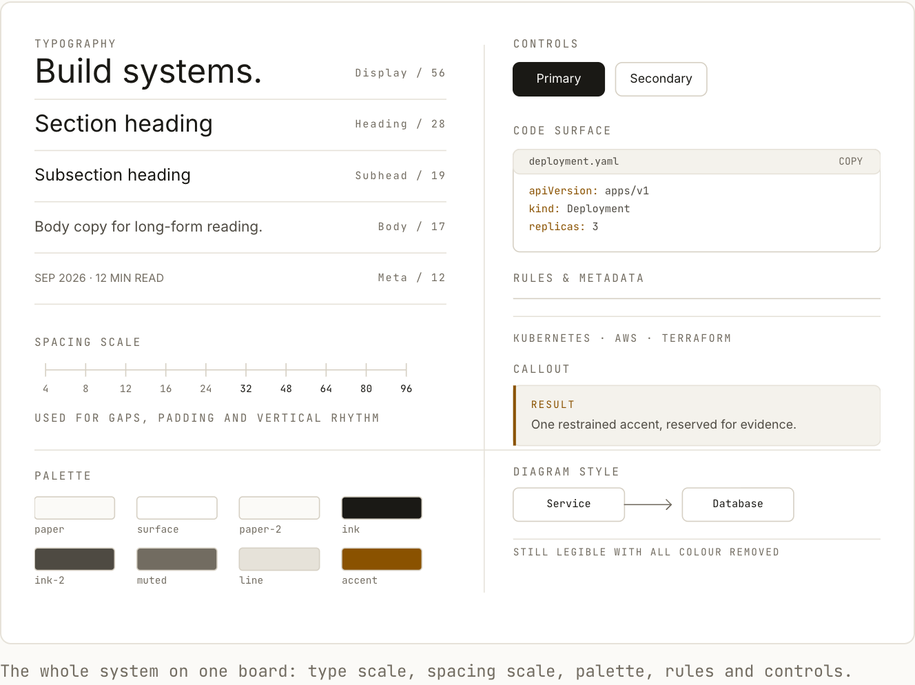
The site should still look intentional if all colour is removed.
That became a useful design test.
06. Typography became the primary interface
On a content-heavy website, typography is not decoration.
It is the interface.
Different areas of the site needed different reading behaviour.
The project index needed relatively high information density.
Long-form writing needed a much narrower reading measure.
Code blocks needed room to breathe.
Metadata needed to remain visible without competing with headings.
So I treated typography as a system.
A typical article page follows roughly this hierarchy:
Eyebrow / metadata
        ↓
Large article title
        ↓
Description
        ↓
Publication metadata
        ↓
Body
        ↓
Section heading
        ↓
Body
The main reading column stays intentionally narrow.
Roughly:
680–760pxThis gives long technical articles a comfortable line length without making the page feel constrained.
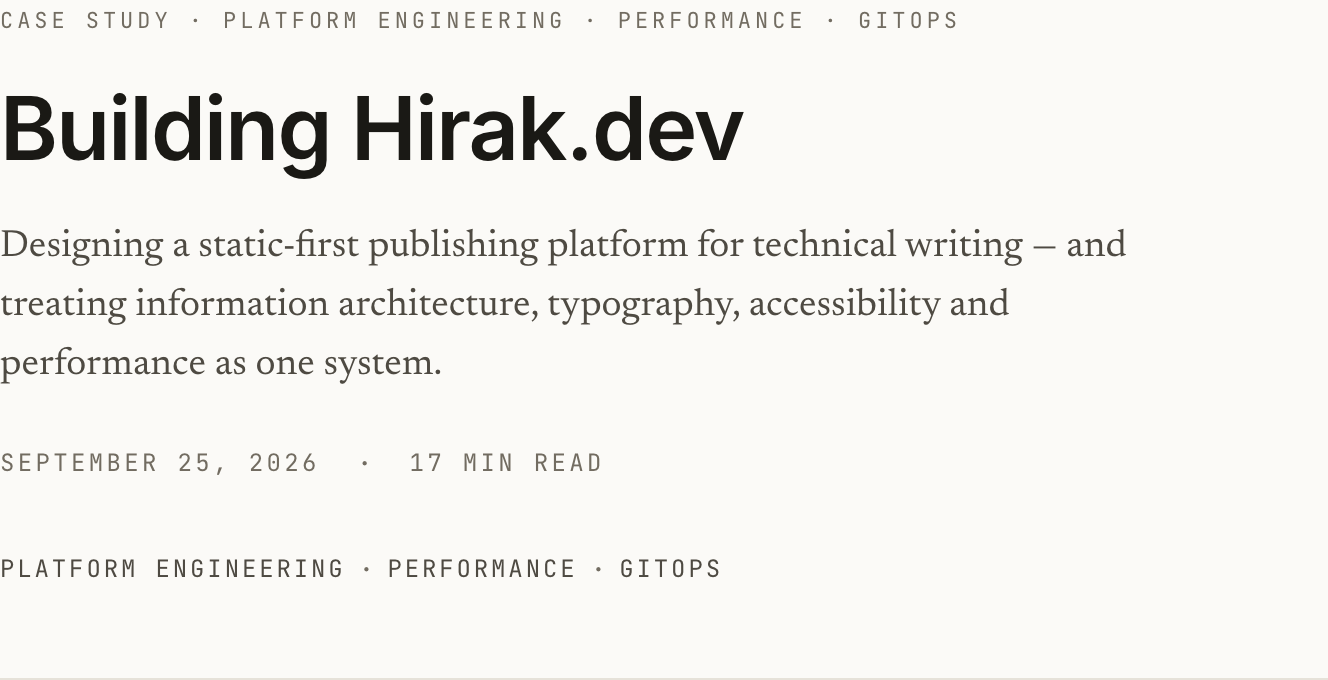
An article header: eyebrow, title, description, date and reading time, then the topic list.
Monospace typography is used selectively for:
- dates
- metadata
- commands
- measurements
- filenames
- code
Using monospace everywhere would make the website feel like a terminal-themed portfolio.
Using it selectively gives technical details a distinct voice without overwhelming the reading experience.
07. Responsive design was not an afterthought
I did not want mobile to be a scaled-down desktop.
Technical content creates specific responsive problems:
- long shell commands
- wide tables
- code blocks
- diagrams
- screenshots
- benchmark results
- deeply nested headings
The article layout therefore needed explicit behaviour for smaller screens.
At desktop widths:
Site max width:      ~1200–1280px
Article width:       ~700px
Page padding:        ~32–48px
At mobile widths:
Single-column layout
20–24px page padding
Reduced section spacing
Horizontal code overflow
Scrollable wide tables
Responsive diagrams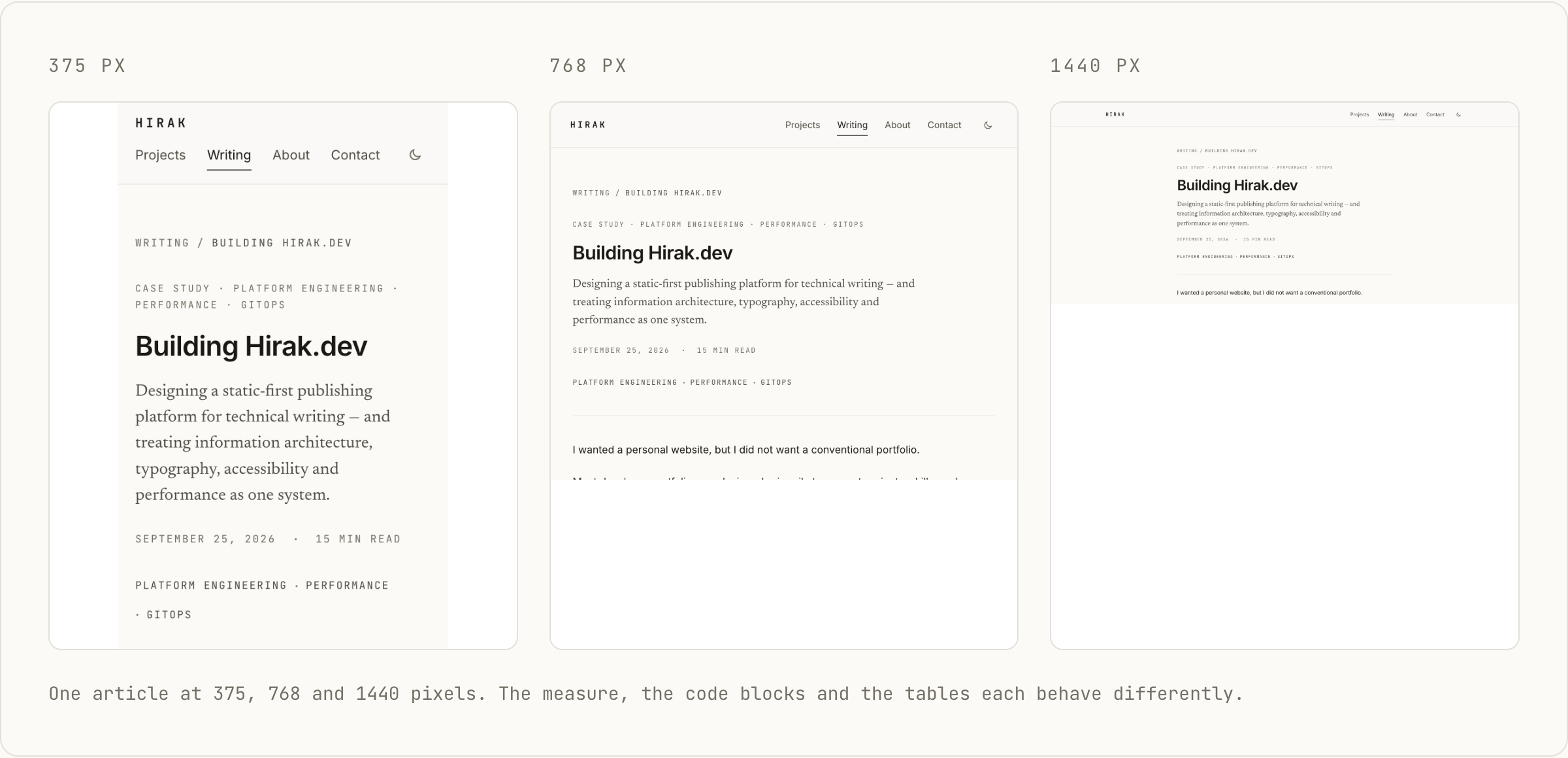
The important part was not making everything smaller.
It was deciding what should reflow, what should scroll, and what should retain its natural dimensions.
08. Building a small technical component system
The publishing system needed to support more than paragraphs and headings.
I wanted articles to include:
- code
- terminal sessions
- architecture diagrams
- benchmark results
- metric blocks
- callouts
- figures
- tables
- experiment configurations
So I built a small set of reusable content primitives.
ArticleLayout
CodeBlock
Terminal
Callout
MetricGrid
BenchmarkTable
Figure
ArchitectureDiagram
RelatedPosts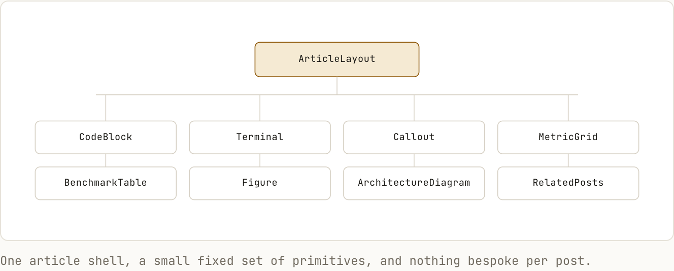
The goal was not to build an enormous design system.
It was to create enough primitives that technical writing could remain visually consistent without hand-styling every article.
A benchmark should look like a benchmark everywhere.
A warning should look like a warning everywhere.
A terminal session should never need custom styling inside an individual post.
09. September 11 — The CMS should disappear
This became the most important architecture decision.
My original mental model was:
Visitor
   ↓
Frontend
   ↓
CMS API
   ↓
Content
There was nothing inherently wrong with this.
But the site did not require dynamic content at request time.
Articles change when I publish them, not every time somebody visits them.
So I inverted the relationship.
The CMS became part of the publishing process instead of part of the delivery process.
The final model became:
Keystatic
    ↓
Local content
    ↓
Git
    ↓
Astro build
    ↓
Static HTML
    ↓
CDN
    ↓
Visitor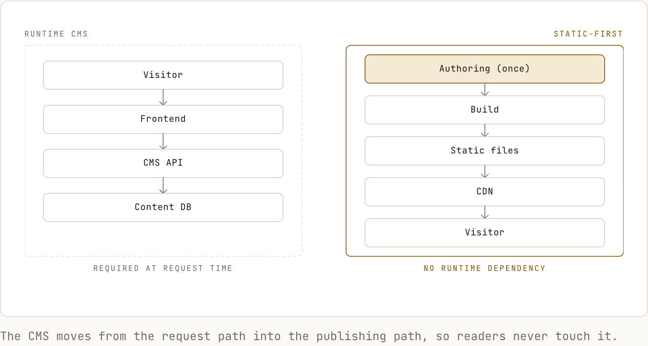
That meant the public website had no reason to know the CMS existed.
This was exactly what I wanted.
10. Why Keystatic
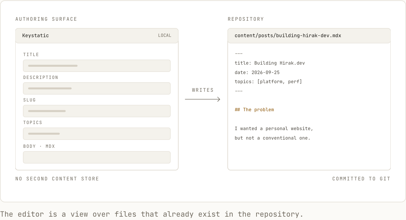
I wanted an editor, but I also wanted files to remain the canonical content representation.
Keystatic fit that model well.
The editor works on top of content stored in the repository rather than requiring a completely separate content database.
Conceptually:
CMS UI
   ↓
MDX
   ↓
Git
That gives me the convenience of structured authoring without losing the properties of Git-based content.
The repository remains readable without the CMS.
The content remains portable.
The entire history remains version controlled.
11. Git became the source of truth
The publishing workflow is intentionally straightforward.
Write
  ↓
Save locally
  ↓
Preview
  ↓
Commit
  ↓
Push
  ↓
Validate
  ↓
Build
  ↓
Deploy
The CMS does not publish directly to production.
Git does not merely contain the application code.
It contains the content as well.
This gives every article:
- history
- diffs
- rollback
- reviewability
- branch-based previews
It also makes the workflow extremely compatible with coding agents.
12. The coding agent is part of the editorial workflow
One interesting consequence of the architecture is that a coding agent can operate on both the application and the content.
I can use the CMS when I want a visual editing experience.
I can use the agent when I want assistance with:
- restructuring an article
- adding frontmatter
- creating a diagram
- validating internal links
- generating reusable components
- formatting benchmark data
- checking image metadata
- fixing build failures
The workflow becomes:
                Me
                 │
        ┌────────┴────────┐
        │                 │
        ▼                 ▼
    Keystatic         Coding Agent
        │                 │
        └────────┬────────┘
                 ▼
            Git Repository
                 │
                 ▼
                CI/CD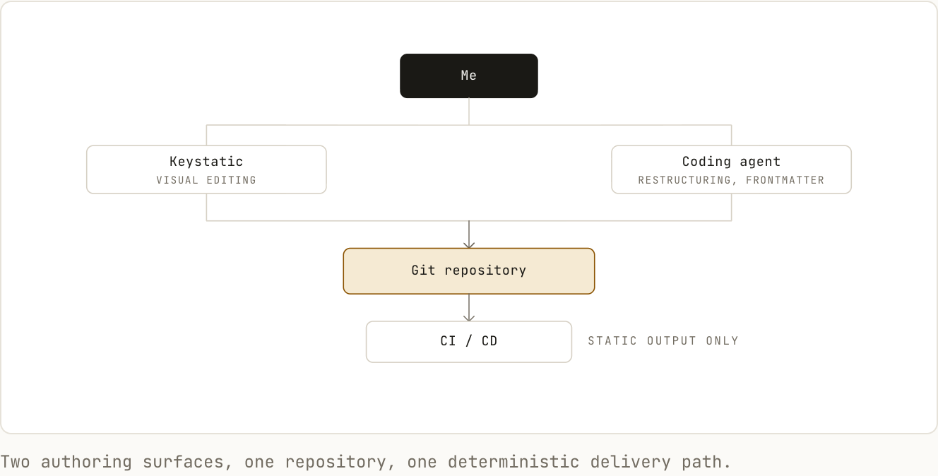
The agent is not required for the site to function.
That is important.
Routine publishing remains deterministic.
The agent is used when intelligence is useful, not as an essential infrastructure dependency.
13. Previewing through the real renderer
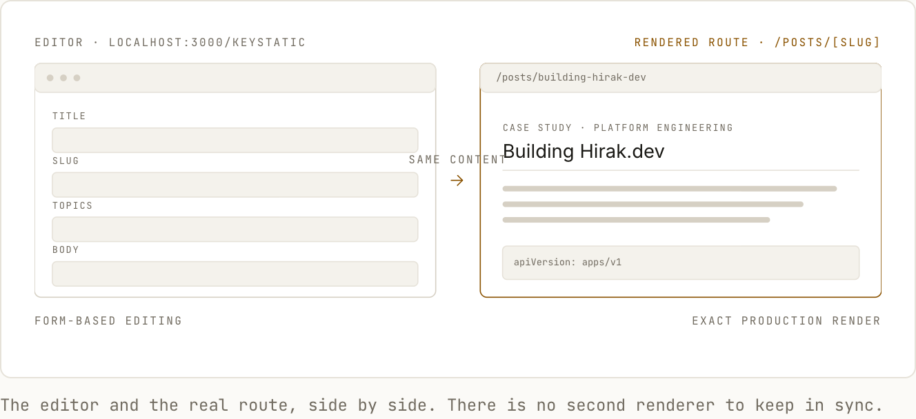
I did not want the CMS to maintain a second interpretation of the page.
The most reliable preview is the actual website.
So locally, the workflow is:
Keystatic
    ↓
Save content
    ↓
Astro detects change
    ↓
Real article route
I can keep the editor in one tab and the rendered article in another.
For larger changes, Git branches create another level of preview:
Branch
   ↓
Push
   ↓
Preview deployment
   ↓
Review
   ↓
Merge
This means I can inspect the actual production build before changing the live website.
14. Static by default
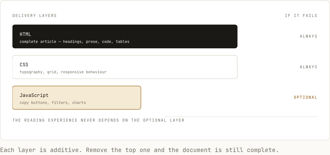
The site’s core reading experience does not require client-side JavaScript.
A normal article can be represented as:
HTML
+
CSS
+
Images
JavaScript is only introduced where it adds something meaningful.
Examples include:
- copying code
- search
- interactive charts
- optional diagrams
This follows a simple rule:
JavaScript should enhance the document, not be required to read it.
This also keeps the mental model of the site simple.
The website is fundamentally a document system.
15. Performance as an architectural property
Performance was not something I wanted to add at the end.
Most of the largest performance decisions happened before implementation.
Choosing static generation already removed several potential runtime costs.
The remaining work focused on keeping individual pages disciplined.
That included:
- minimal JavaScript
- responsive images
- modern image formats
- restrained font loading
- static generation
- limited third-party scripts
- avoiding unnecessary component hydration
- keeping article layouts simple
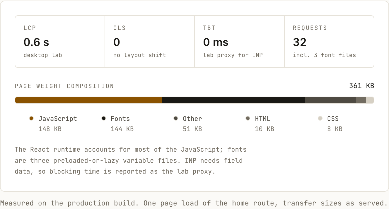
The measurements I care about include:
LCP
CLS
INP
Transferred JavaScript
HTML size
CSS size
Image weight
Font requests
Every number below was measured against the production build, not a development server.
16. Accessibility
Minimal interfaces are not automatically accessible.
In some cases, reducing visual elements can make state and interaction harder to perceive.
So accessibility needed explicit attention.
The implementation includes or should include:
- semantic page landmarks
- logical heading order
- skip navigation
- visible keyboard focus
- sufficient contrast
- reduced motion support
- meaningful image alt text
- properly labelled controls
- accessible tables
- native elements where possible
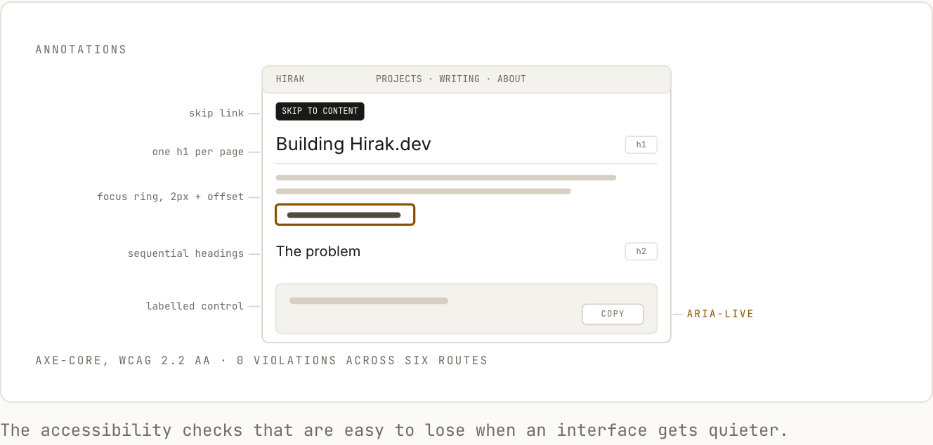
I try to use ARIA only when native HTML cannot express the interaction correctly.
That keeps both the markup and the accessibility model easier to reason about.
17. Technical content exposed edge cases
Designing normal marketing pages does not expose the same problems as designing technical documentation.
A technical article might suddenly contain:
kubectl get pods --all-namespaces --field-selector=status.phase=Running -o custom-columns=...or a table with eight columns.
Or a network diagram that is wider than the reading column.
Or a block of logs containing extremely long identifiers.
The design system therefore needed explicit behaviour for edge cases.
For example:
Code
→ horizontal scrolling


Tables
→ contained horizontal scrolling on small screens


Figures
→ may break out beyond article measure


Text
→ remains constrained to readable width


Diagrams
→ responsive but never compressed into illegibility
Code scrolls horizontally. Wrapping a shell command changes what it means.
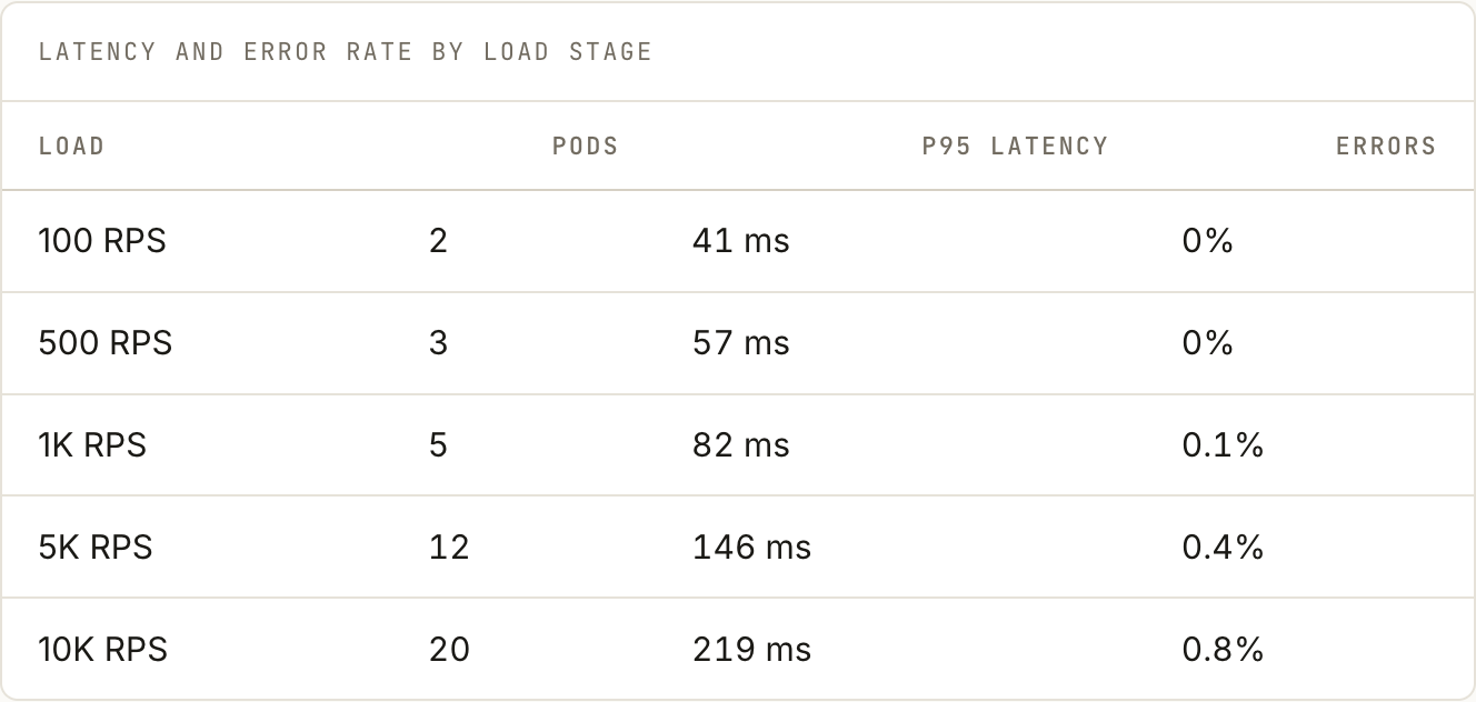
Tables keep their natural width inside a scrollable region, with numeric columns right-aligned.
These details are easy to overlook until the website starts containing real engineering content.
18. Search engine architecture
SEO was mostly an exercise in keeping the site understandable.
The core routes remain stable:
/posts/[slug]
/projects/[slug]
Each page can expose:
- canonical URL
- descriptive title
- meta description
- Open Graph metadata
- structured data
- semantic headings
The site can also generate:
sitemap.xml
robots.txt
RSS
Internal linking becomes particularly important as the writing archive grows.
A Kubernetes article should naturally connect to related experiments, projects, and follow-up posts.
The goal is not to manufacture SEO pages.
It is to make the information architecture legible to both humans and crawlers.
19. September 18 — Cards were making the site feel like a dashboard
An earlier version used cards for almost everything.
Project cards.
Article cards.
Topic cards.
Featured cards.
They were visually consistent, but they also made every piece of information feel equally important.
The website started looking more like a SaaS dashboard than a publication.
So I removed many of them.
Writing entries became simple editorial rows.
Project listings became structured blocks separated by rules.
Typography and alignment took over the work that containers had been doing.
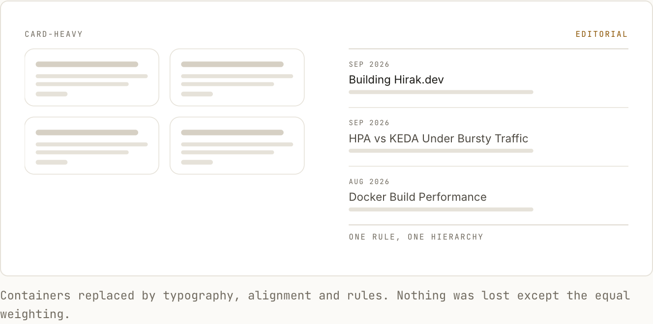
The result felt both simpler and more intentional.
20. CI/CD turned publishing into software delivery
A content push goes through the same discipline as a code change.
The pipeline can validate:
Content schema
Required metadata
Unique slugs
Internal links
Image references
TypeScript
Linting
Static build
Conceptually:
git push
   ↓
validate
   ↓
test
   ↓
build
   ↓
deploy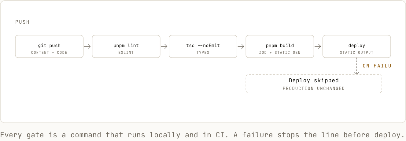
If validation fails, the current production site remains untouched.
That makes publishing predictable.
21. Final architecture
The finished system is deliberately small.
                 AUTHORING


            Keystatic      Agent
                 \          /
                  \        /
                   Git Repo
                      │
                      ▼
                    GitHub
                      │
                      ▼
                     CI
                      │
                      ▼
                    Astro
                      │
                      ▼
                 Static Files
                      │
                      ▼
                     CDN
                      │
                      ▼
                   Visitor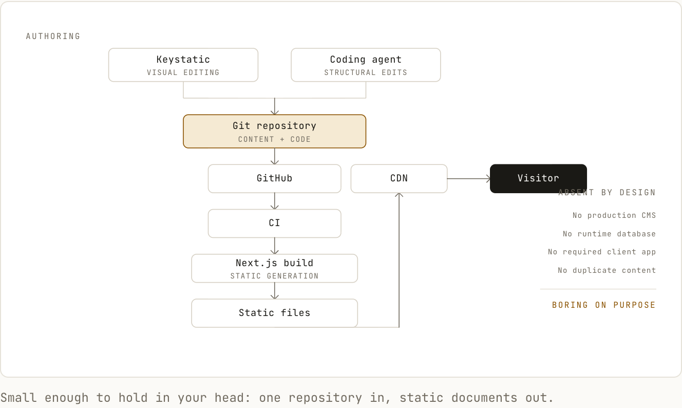
There is:
No production CMS dependency
No runtime database
No required client-side application
No duplicate content store
The application is mostly a publishing pipeline that produces documents.
That is intentionally boring infrastructure.
And for this kind of website, boring is useful.
22. What I would measure
The project is not complete when the website looks finished.
So I measured whether the architectural decisions actually produced the intended result.
The numbers below are from the production build:
Lighthouse performance
LCP
CLS
INP


Total JavaScript
Total CSS
Typical article weight


Accessibility audit
Broken link count


Build time
Deployment time


Mobile performance
Desktop performance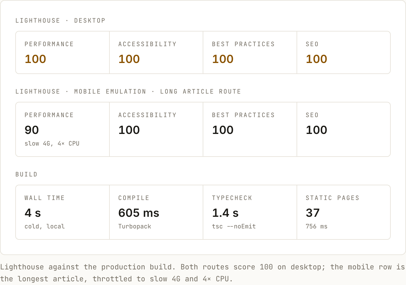
Measurements, not assumptions.
23. What I learned
The most useful lesson from this project was that frontend work is often less about individual components than about the systems surrounding them.
The final interface is influenced by:
Content model
Information architecture
Typography
CSS
Responsive behaviour
Accessibility
Build architecture
CMS design
Version control
Deployment
Each decision changes the others.
A CMS choice affects previewing.
A content model affects URLs.
Typography affects layout.
Layout affects responsive behaviour.
Rendering strategy affects performance.
Deployment affects editorial workflow.
Treating those as one system produced a much better result than treating the website as a collection of pages.
24. The outcome
What started as a personal portfolio became a small publishing platform.
The final system gives me:
- a structured CMS
- Git-backed content
- local previews
- branch previews
- static production pages
- reusable technical components
- responsive long-form layouts
- automated deployment
- measurable performance
- complete control over the frontend
More importantly, the platform is designed around the work I actually want to publish.
Projects can explain what I built.
Writing can explain what I learned.
Experiments can show evidence.
The website itself becomes another engineering project documenting the decisions behind it.
25. Closing note
I wanted the website to communicate one idea clearly:
Build systems. Test assumptions. Write down what happens.
The site is now part portfolio, part engineering notebook, and part publishing system.
And because the architecture is intentionally simple, the focus remains where it should be:
on the work.